-A while back, my good friends, Jorge Gutierrez, and Sandra Equihua asked me to help them develop the look and color styling of their new t.v. show idea, "El Tigre". Working under the guidance of Jorge, and art director, Roman Laney. I started with rough sketches of the various locations that would be used in the pilot episode.
Above: A few early exploratory sketches from "El Tigre!"
Most of my early sketches were close in value, with little or no black in the backgrounds. There was a lot of black on the characters, and I wanted them to read well. But this gave a sort of calm feeling, and Jorge wanted everything in the show to be "Super Macho!"... having more contrast, more texture, more of everything. It made designing a bit more difficult, but also gave the intensity Jorge wanted. A lot of the art styling was worked out in the pilot by Roman. By the time "El Tigre" had been picked up as a series... the look had been fully established.
Above: Art director, Roman Laney, and his team took a lot of the development art, and created a beautiful, and unique look for "El Tigre". Check out Roman's website to see more amazing art from the show.
Above: A visual structure chart for one of the episodes.
I was working overseas, away from the rest of the team, so it was essential that I knew what Jorge, Roman, and Director Dave Thomas wanted for each episode. We were under such tight deadlines that there really wasn't much wiggle room for exploration. You will notice, that all the art follows the story Arc in the visual structure. We set up themes early in the show... and then generally kept them throughout all the episodes. For example, high contrast for exciting segments, low contrast for duller moments. We also used color themes throughout the show. Evil was often symbolized by using black and red, (or the main color of the villian) and El Tigre with green.With so many episodes going on at the same time... it was important that everyone was on the same page.
Above: A small sampling of my color scripts from the show.
My pal, Dave Thomas' storyboards were the blueprint for everything I did. Dave is a real master of timing, and staging. He and Jorge had worked everything out to make the rest of the teams work as easy as possible. I would usually do a first pass on the color script based on Dave's beat boards, and sometimes keys from Roman. Then Roman, Jorge and I would talk about it... after which I would make my adjustments. From the color scripts, the rest of the team would have a feel for lighting, mood, color.
A fan video... cut together from various episodes.
As in most of the projects I am involved with, "El Tigre" was a collaboration of friends, who also happen to be some of the most talented people I know. I was saddened when I learned that "El Tigre" had been canceled. Not only is it one of the best projects I have ever worked on... it is one of my favorite shows to watch.
Thank you Sandra, and Jorge for making a place for me. -tod
Bad People
My old schoolmate, Michelle Meeker, asked me to take part with 11 other animation artists in her short film "When I Grow Up."
Michelle interviewed young people aged 7-10 years-old about what they would like to be when they grow up, and then interviewed elders to find out that they dreamed of being when they were younger and where life took them. She then gave short sound clips from the interviews to individual animators. Each animator had artistic control over their own piece. The film shows what we dream about becoming as children, and where life really ends up taking us.
I called my section "Bad People", the old woman in the interview talked about her dream of becoming a doctor. But her dreams were taken away by "Very Bad People". She wasn't specific about who the "Bad People" were... but from her accent, and her age... I guessed it to be the Nazi's during WWII ... but in fact I never knew for sure.
Above and Below: My design keys from Michelle Meeker's short film "When I Grow Up."
I wanted to be as vague in my design as the woman had been in her interview. Some of the other artists in the project became upset because of my seeming "lack of research". In fact, I did a lot of research on the uniforms, medical instruments,and architectural style for the piece. But instead of being literal... I chose to create a nightmare. Uniforms that might remind one of SS troops... without being specific. I also wanted the art style to be reminiscent of WWII poster art... but again, to give only a hint of the style... without being too specific to the period.
Ironically, most of these design keys were created at the old Nazi headquarters in Viborg, Denmark. The old fire station the SS had commandeered during the war... which also served for a time as the "The Open Workshop".
"Bad People" was animated in "After FX" at my pal P'Nat's studio...
XHabition
... and here is the official trailer for "When I Grow Up."
Birds Of Thailand
I have wanted to do a series of bird paintings since first coming to Thailand. But I have always been too busy with animation projects to just sit down and do something for "me".
Thus I've decided to give myself a reason to paint, and am putting together an art show called "The Birds Of Thailand." Inviting both local artists, and bird lovers to participate.
It's quite amazing how many different bird species exist in southeast Asia. I am hoping the show will help raise awareness of Thailand's birds, and their shrinking habitats.
All images copyright Tod Polson
Escape Of The Gingerbread Man
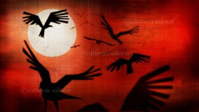
I was approached by Juck Somsaman, founder of Monk Studio to help develop and train his team in Bangkok through the creation of a short film. As it so happened my friends in Ireland at The Cartoon Saloon approached me at about the same time to create an "Irish themed" short to open "The Secret of Kells" feature they were making. Just seemed meant to be...
Above: A small section of the "color script". This board is a combination of quick color sketches, rough 3D renders and more finished backgrounds. The more 3d looking scenes are keyed by going over frames from maya in photoshop.
The main focus of the color script is really making sure the characters read on the backgrounds... and making sure that there is a artistic progression in the film... making sure each sequence and place feels unique from one another... yet still tie together in some way. One of my former students Susanne Olesen came to Thailand for a few months to help paint backgrounds. I've worked some of those back into the script.
"The Escape of the Gingerbread Man" is a personal short film, and the third installment of the "NobleTales" short film series. A series of original stories from around the world... created by my mentor, Maurice Noble, and the group of us fortunate enough to train under him.
Above: An early sketch by me... inspired by the work of that talented Dub, Barry G. Reynolds.
The short has been funded in part by "The Open Workshop", and the "West Danish Film Fund".
To see more artwork, and go behind the scenes, visit:
Escape of the Gingerbread MAN!!!
The Secret Of Kells
Above: The trailer for the "The Secret Of Kells"... The film was directed by my pal Tomm Moore, co-directed by Nora Twomey, Produced by Paul Young, Art Directed by Ross Stewart, with additional design excitement by Adrien Merigeau.
-Above: A few of my development sketches for Brendan
My main job on "Brendan" was helping set the color... and to a lesser extent help out with development. Originally I was slated to be head of backgrounds... unfortunately there was a scheduling conflict... so my stay in Kilkenny was shorter than expected. But I was able to get through the rough color script, and Tomm and I were able to get in a few good work outs.
I have to say the Brendan team was different than any other I have worked with... they were all "artists" who happened to be doing animation. For example, Producer Paul Young was heavily involved in theater, and writing a comic strip. Art director Ross Stewart could as easily be off painting canvases... or playing music ... as designing film.
Click here to visit: Ross Stewart's Site!
So the approach to making Brendan was totally different than I was used to... the art team wasn't referencing Disney, or UPA, they were just splashing color... blowing paint around... creating textures... looking at ancient illuminated manuscripts... just trying to create something new that fit the story. It was totally refreshing... and in my short time in Ireland... I learned a lot! I couldn't really rely on shortcuts... I actually had to draw! And I have to admit... I was more than a bit rusty. But the approach to the art was simply a reflection of Tomm, and the crew making the film... honest, real, and direct.
Above: More development sketches. I tried to keep "color themes" to the various sequences of the film. For example... the vikings represented death and destruction. So I thought it would be good to use more "primitive color"... the kind of colors a caveman might use... for those sequences.
Above: A section of the color script for "Brendan and the Secret Of Kells". All the sketches here are based on the storyboard, painted after talking to Tomm, and Ross about the mood and feel of each sequence. The color script is a rough guide for the crew... a sort of "map" for the background artists... fx artists... compositors, and so on. These sketches were completed very early in the process... and you can see how they were used by watching the trailer. It is interesting to me to see what changed, and what stayed the same in the final film cut.
I feel very fortunate to have been a small part of "The Secret Of Kells" ... a very special film, made by some special people... who I am lucky enough to call friends. -tod
The Blog Of Kells! The Cartoon Saloon!
Khan Kluay
Khan Kluay- TV teaser from Tod Polson on Vimeo.
Several years ago Kantana Films asked me to help develop a t.v. show project called "Khan Kluay". The stories were about the adventures of a little Thai elephant that would go on to save Thailand from outside forces.
Being short on time, I designed something very simple and graphic that would be easy to animate in Maya. I decided to make the end of the teaser a series of illustrations... showing less animation, and more of the world of "Khan Kluay".
Above: Early character and color sketches for the t.v. show pitch. Several of these designs are inspired by doodles by the famous Mark Oftedal.
This pitch generated a lot of interest in the project in Europe. Thus the studio asked me to develop "Khan Kluay" as a feature film.
Khan Kluay- Early Test from Tod Polson on Vimeo.
We got some seed money to develop the feature. I was able to bring over writer Ariel Prendergast to help develop the script, and "super artist" Aaron Sorensen, as my co-director. Above is the first test we did with a more 3D look.
I wanted to keep a soft, artsy children's book feel. The studio wanted to make the film look like a Pixar movie... but without Pixar's budget, or experience. This test was my compromise. The rigs weren't finished... and we were still figuring out the background styling... but it was enough for the studio to push forward with production.
I worked closely with Aaron Sorensen on the story and character design, Aaron's style is really graphic and fun... translating well to 3D. It's Ironic that Kantana "let us go" because the character designs were too "western"... after all, the studio hired us to help make the film "international". The designs remained virtually unchanged after we left... and can be seen on t-shirts, cups, and other products throughout Thailand.
In this video clip I explain our basic development process, and present an early trailer to the movie. The trailer at the end of the presentation is "unfinished". My co-director, Aaron Sorensen, and I were only able to make a "first pass" on the animation, texture and lighting... as the studio felt it was "good enough". The sound on the trailer was re-dubbed after Aaron and I left the project.
The two years I spent as the creative director of "Khan Kluay" was a real joy. A small crew of us working together, writing, designing, and researching. The team spent a lot of time "outside" the studio, researching how wild and domesticated elephants live, working with "Mahuts", and animal experts. We also worked closely with historical experts, and even members of the royal family to make sure that we got everything just right.
Here are some samples of the key artwork we generated based on the script. A big thanks to Patchanu Noree and the crew for doing such a great job! Patchanu is an amazing designer, and a good friend, who was able to help translate my vision to the screen. We made dozens of paintings like this describing each major story beat. Spending months designing trees, grass, Thai huts, insects, clouds... trying to give the film a unique feel... mixing Thai and western design. After I left, the studio opted for "realism" in styling... but I think some of the spirit of what we made still remains. Until next time - tod
Several years ago Kantana Films asked me to help develop a t.v. show project called "Khan Kluay". The stories were about the adventures of a little Thai elephant that would go on to save Thailand from outside forces.
Being short on time, I designed something very simple and graphic that would be easy to animate in Maya. I decided to make the end of the teaser a series of illustrations... showing less animation, and more of the world of "Khan Kluay".
Above: Early character and color sketches for the t.v. show pitch. Several of these designs are inspired by doodles by the famous Mark Oftedal.
This pitch generated a lot of interest in the project in Europe. Thus the studio asked me to develop "Khan Kluay" as a feature film.
Khan Kluay- Early Test from Tod Polson on Vimeo.
We got some seed money to develop the feature. I was able to bring over writer Ariel Prendergast to help develop the script, and "super artist" Aaron Sorensen, as my co-director. Above is the first test we did with a more 3D look.
I wanted to keep a soft, artsy children's book feel. The studio wanted to make the film look like a Pixar movie... but without Pixar's budget, or experience. This test was my compromise. The rigs weren't finished... and we were still figuring out the background styling... but it was enough for the studio to push forward with production.
I worked closely with Aaron Sorensen on the story and character design, Aaron's style is really graphic and fun... translating well to 3D. It's Ironic that Kantana "let us go" because the character designs were too "western"... after all, the studio hired us to help make the film "international". The designs remained virtually unchanged after we left... and can be seen on t-shirts, cups, and other products throughout Thailand.
In this video clip I explain our basic development process, and present an early trailer to the movie. The trailer at the end of the presentation is "unfinished". My co-director, Aaron Sorensen, and I were only able to make a "first pass" on the animation, texture and lighting... as the studio felt it was "good enough". The sound on the trailer was re-dubbed after Aaron and I left the project.
The two years I spent as the creative director of "Khan Kluay" was a real joy. A small crew of us working together, writing, designing, and researching. The team spent a lot of time "outside" the studio, researching how wild and domesticated elephants live, working with "Mahuts", and animal experts. We also worked closely with historical experts, and even members of the royal family to make sure that we got everything just right.
Here are some samples of the key artwork we generated based on the script. A big thanks to Patchanu Noree and the crew for doing such a great job! Patchanu is an amazing designer, and a good friend, who was able to help translate my vision to the screen. We made dozens of paintings like this describing each major story beat. Spending months designing trees, grass, Thai huts, insects, clouds... trying to give the film a unique feel... mixing Thai and western design. After I left, the studio opted for "realism" in styling... but I think some of the spirit of what we made still remains. Until next time - tod