Book of Life: Parade Balloons 2
Above: Parade balloon concepts inspired by Mexican folk toys- for the animated feature "The Book of Life."
The Book of Life: Galleon Parade Floats
One of the areas I focused on in the "Book of Life" was the festive parade near the entrance to the "Land of the Remembered." Each float in the parade represented a different character from the movie. Here are but a few of the many sketches I made for the Galleon float.
Above: My first sketches captured the fractured quality that the creative leads were looking for... but weren't that unique to the world of the dead.
Above: So I played with more ornate versions of the ship. Thinking of it as a character unto itself.
Above: First I focused on the overall shape of the ship. Then I spent time detailing out areas that were important to the story. For example, in one version of the storyboard the hero lands on the ships sail yard, and another character jumps from the crows nest. -tod
Book of Life: Entrance to the "Land of the Dead" 1
Above: Exploration for the entrance to "The Land of the Dead."
The LOTD, which would become "The Land of the Remembered" was a great place to explore. A place where almost anything could happen. I reckoned that gravity wouldn't act exactly the same way as it did on earth... so played with floating walk ways... upside down roads etc. This land was neither night nor day. There was no bottom or top to this world... it just kept going and going.
In the final movie, the hero comes through a much simpler door... something more parallel with the "Land of the Living." But a number of ideas made it into the overall treatment of the world.
More entrance ways to come.
The Book of Life: Fountains 1
Above: A few of my fountain sketches for "The Book of Life."
Every detail in the "Land of the Forgotten" was thought out carefully. Here I was exploring a fountain that was planned near the grand entrance. You'll notice most of my designs are very rough. My technique for most every assignment was to explore as many ideas as I could in the short time I was given. Trying to give as many choices to the creative team as possible. I explored dozens of fountain ideas. Whimsy and fun were the artistic direction I was given.
More fountains to come...
The Book of Life: Parade Balloons 1
Above: Parade balloon exploration.
One area that I focused on in The Book of Life was the parade at the beginning of the "Land of the Remembered." Director Jorge Gutierrez imagined this land as a constant party, filled with balloons, floats... and anything remotely festive. My early balloon sketches were inspired by Mexican Day of the Dead sugar skulls.
Here I was mostly exploring shape and color. Other than art director Paul Sullivan, I was the first artist on the team to explore this world. And though most of my balloon designs were never used in the film. They helped inspire other elements, and the general shape language used.
More balloon sketches to come...
The Book of Life: Travel Posters
Above: Maria dreamed of traveling the world... and plastered the walls of her room with travel posters. Several of us on the Book of Life design team contributed poster ideas. These are a few of mine.
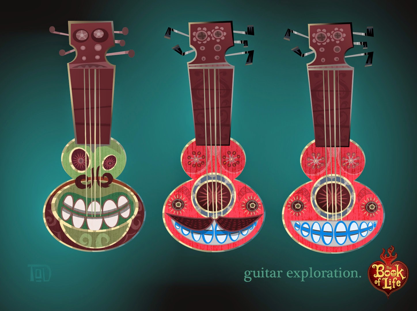
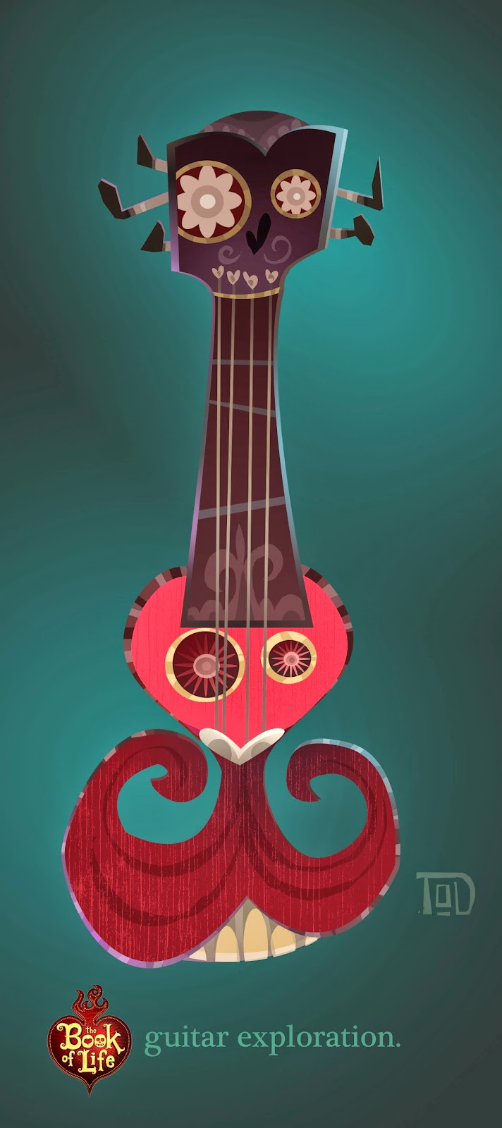
The Book Of Life: Guitar Exploration
Above and below: Variations on a theme... early guitar exploration.
At long last "The Book of Life" is out on the big screen and I am now able to share some of the concept art for the movie.
My main focus on the film was exploring what was called "The Land of the Dead." Marketing thought the word "dead" was a real downer... so the land was later renamed "The Land of the Remembered."
Director Jorge Gutierrez described the world to me as one of"...whimsy... full or round fun shapes... a land that is essentially one long continuous party." Here is a few takes on a guitar... some of my first designs on the movie. As far as I know none of these designs were used as seen here... but led to other ideas. And helped the art team better visualize what the Land of the Dead would become.
Comics Alliance Reviews The Noble Approach
As the first anniversary of The Noble Approach: Maurice Noble and the Zen of Animation Design draws near... great reviews are still coming in for the book! This time from Patrick A. Reed of Comics Alliance.
Read the post HERE!
The Book of Life: Part 1
Above: One of the trailers from the book of life.
Things have been fairly quiet here on the blog for the last year. Besides some health issues, promoting "The Noble Approach," having a new baby and moving to Korea... I was busy helping director Jorge Gutierrez put together his first feature film at Reel FX in Texas... "The Book of Life." Unfortunately I am unable to show any of my own artwork for the movie at this time... but there is plenty of eye candy from me and the amazing crew in the upcoming Art Of Book of Life.
There is also some tasty treats on the official website by art director Paul Sullivan.
After the book and movie come out I will be able to share a bit more. Until then...
Labels:
animation design,
book of life,
feature,
Jorge Gutierrez,
Tod Polson
A Gingerly Prepared Meal -or- Ginger eats a close relative.
A promotion video for the store window. Directed and animated by Poul Riishede
Years ago Poul left his native Denmark to help me make my film at The Monk Studio Thailand. Like most of my personal film work, I had no budget to pay anyone. But despite that, Poul went above and beyond what was expected... and helped make the film a reality.
A few pages from the menu. Layout and photography by Poul Riishede
During the production of the film, Poul constantly yearned for a well made pancake. Then after a while, he decided to take matters in his own hands... and opened up his own shop! I owe Poul so much for helping me make my own dream a reality... so offered him and his wife the character to help them get their little dream business going. I never expected him to run, run, run with the character the way he has... but I am happy to see little Ginger running again. -tod
Some Ginger goodies for the kids! By Sansanee Riishede!
Shaw Cable Valentine's Spot
Not too long ago I was asked to help design an ad for Shaw Cable. This was one of a series of commercials produced by Liaka House, and directed by the multi-talented Aaron Sorensen.
Above: Color studies.
For this particular spot I was asked to push the color and lighting by adding subtle hints of yellow, purples and aquas not found in most Shaw spots. Even this subtle approach was a huge leap for the client... who in the end decided on a more muted version.
Above: More keys and exploratory sketches.
A number of people have asked me about my approach to color scripting. As you can see... it's very simple. Many designers get caught up in making beautiful art, and forget that it is the final film image that matters most. I've found that it's far better to put down a lot of quick loose ideas than spend a lot of time on a few highly rendered keys. Yes, there is a time for that too! But not in a rough color script. This method will give the client and director more to choose from... and increases the chance of getting something interesting on the screen.
PERSONAL NOTE: Most of this year has been spent balancing freelance, teaching, and a new son! Thus I've been unable to post as often as I would like. But thank you for checking in every once in a while for new updates and posts. - Cheers... tod
Above: Color studies.
For this particular spot I was asked to push the color and lighting by adding subtle hints of yellow, purples and aquas not found in most Shaw spots. Even this subtle approach was a huge leap for the client... who in the end decided on a more muted version.
A number of people have asked me about my approach to color scripting. As you can see... it's very simple. Many designers get caught up in making beautiful art, and forget that it is the final film image that matters most. I've found that it's far better to put down a lot of quick loose ideas than spend a lot of time on a few highly rendered keys. Yes, there is a time for that too! But not in a rough color script. This method will give the client and director more to choose from... and increases the chance of getting something interesting on the screen.
PERSONAL NOTE: Most of this year has been spent balancing freelance, teaching, and a new son! Thus I've been unable to post as often as I would like. But thank you for checking in every once in a while for new updates and posts. - Cheers... tod
Labels:
aaron Sorensen,
Color design,
color scripts,
commercial,
concept,
Tod Polson
Episode 15: Rising Son Color
For Rising Son I focused on contrasting a "clean" fresh look (note the rare blue skies) against the grit and grime of Miracle City. Some of the color variations are subtle. I had a good idea of what the creative leads on the show were looking for. But since we were on a pretty tight deadline, and I was working from Asia, I thought it would be better to give those variations and let the leads choose.
To see more color scripts from the show please visit HERE.
Subscribe to:
Posts (Atom)


