Showing posts with label Jorge Gutierrez. Show all posts

El Tigre Concept: Dad's humble abode

Some more Concepts from El Tigre- This time concepts for Dad's (White Pantera's) room.

White Pantera is a super hero... but refuses payment for his good doing... so lives in complete squalor. I thought it would be fun to push the contrast between the sparseness of Dad's room with the opulence of super-villain Grandpa's fancy crib.

As usual I explore the bathroom area early on... to get a better handle on what sort of man lives in this space.


El Tigre Concept: Grandpa's Crib


Above: Early sketches for Grandpa's Crib.

A number of years ago Jorge Gutierrez asked me to create concept sketches for his show  El Tigre. The goal was to create a bunch of fun visual ideas that I would then feed to the crew in Los Angeles. Since I was working overseas, I would basically have to pitch my concepts to the crew with lots of written notes etc.  If Jorge, co-creator Sandra Equihua, director Dave Thomas, and art director Roman Laney liked the direction of a certain rough idea, we would explore it further in additional sketches.

The Concept- Grandpa is a retired super-villain, and we wanted his room to be a little over the top. His every vice at the ready, gambling TV, exotic drinks, and lots of gold, red, and black. It was inspired in a large part by the movie Scarface.

The earliest sketches simply explored shape.

The Book of Life: 2D Flashback 002

Above: Some key color frames for the 2D bullfighting flashback

One of the key themes in The Book of Life was that the main star, Manolo, was unable to kill a bull in the ring. He did defeat a bull once however when it was struck by lightning. Which is the moment this key frame illustrates. Of course Manolo goes on to defeat the grandest bull of them all... with love.

Below: Some color day time color exploration.


The Book of Life: 2D Flashback 001

 A concept sketch for one of the 2D flashback sequences. Here we see an idealized version of Manolo's childhood... before the passing of his mother.

For the backgrounds in the 2D sequences I tried to use a design style that complemented Sandra Equihua's character designs: simple color and shape. Here I tried tying everything together by using background colors that echoed those of the characters.

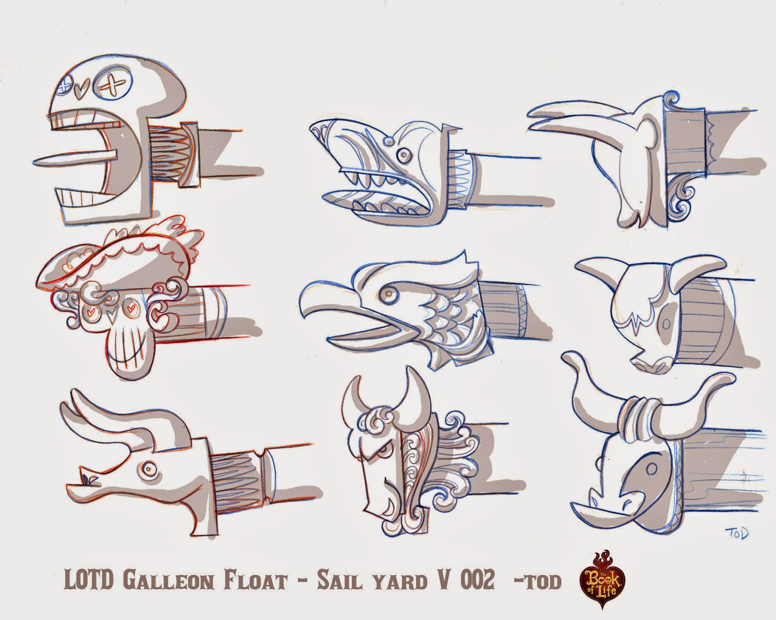
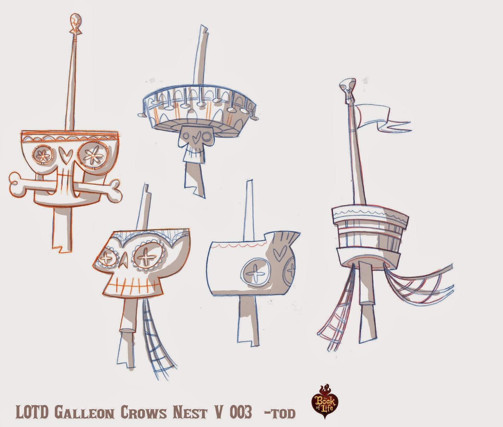
The Book of Life: Galleon Parade Floats

One of the areas I focused on in the "Book of Life" was the festive parade near the entrance to the "Land of the Remembered." Each float in the parade represented a different character from the movie. Here are but a few of the many sketches I made for the Galleon float.

Above: My first sketches captured the fractured quality that the creative leads were looking for... but weren't that unique to the world of the dead.

Above: So I played with more ornate versions of the ship. Thinking of it as a character unto itself.

 Above: I thought it would be fun to have "dolphins" pull the ship down the street.

Above: First I focused on the overall shape of the ship. Then I spent time detailing out areas that were important to the story. For example, in one version of the storyboard the hero lands on the ships sail yard, and another character jumps from the crows nest. -tod


The Book of Life: Fountains 1

Above: A few of my fountain sketches for "The Book of Life."

Every detail in the "Land of the Forgotten" was thought out carefully. Here I was exploring a fountain that was planned near the grand entrance. You'll notice most of my designs are very rough. My technique for most every assignment was to explore as many ideas as I could in the short time I was given. Trying to give as many choices to the creative team as possible. I explored dozens of fountain ideas. Whimsy and fun were the artistic direction I was given.

More fountains to come...

The Book of Life: Parade Balloons 1

Above: Parade balloon exploration.

One area that I focused on in The Book of Life was the parade at the beginning of the "Land of the Remembered." Director Jorge Gutierrez imagined this land as a constant party, filled with balloons, floats... and anything remotely festive. My early balloon sketches were inspired by Mexican Day of the Dead sugar skulls.

Here I was mostly exploring shape and color. Other than art director Paul Sullivan, I was the first artist on the team to explore this world. And though most of my balloon designs were never used in the film. They helped inspire other elements, and the general shape language used.

More balloon sketches to come...

The Book Of Life: Guitar Exploration

Above and below: Variations on a theme... early guitar exploration.

At long last "The Book of Life" is out on the big screen and I am now able to share some of the concept art for the movie. 

My main focus on the film was exploring what was called "The Land of the Dead."  Marketing thought the word "dead" was a real downer... so the land was later renamed "The Land of the Remembered." 

Director Jorge Gutierrez described the world to me as one of"...whimsy... full or round fun shapes... a land that is essentially one long continuous party." Here is a few takes on a guitar... some of my first designs on the movie. As far as I know none of these designs were used as seen here... but led to other ideas. And helped the art team better visualize what the Land of the Dead would become. 

The Book of Life: Part 1


Above: One of the trailers from the book of life.

Things have been fairly quiet here on the blog for the last year. Besides some health issues, promoting "The Noble Approach," having a new baby and moving to Korea... I was busy helping director  Jorge Gutierrez put together his first feature film at Reel FX in Texas... "The Book of Life."   Unfortunately I am unable to show any of my own artwork for the movie at this time... but there is plenty of eye candy from me and the amazing crew in the upcoming Art Of Book of Life. 

There is also some tasty treats on the official website by art director Paul Sullivan. 

After the book and movie come out I will be able to share a bit more. Until then... 

Episode 15: Rising Son Color


Every once in a while I'll dig through my archives and revisit color scripts from El Tigre: The Adventures of Manny Rivera. Though it has been a handful of years since the show was cancelled on Nickelodeon, I have to say it is still probably one of my favorite TV projects. Creators Jorge Gutierrez and Sandra Equihua, art director Roman Laney, and director Dave Thomas tried to push every aspect of the show.

For Rising Son I focused on contrasting a "clean" fresh look (note the rare blue skies) against the grit and grime of Miracle City. Some of the color variations are subtle. I had a good idea of what the creative leads on the show were looking for. But since we were on a pretty tight deadline, and I was working from Asia, I thought it would be better to give those variations and let the leads choose.

To see more color scripts from the show please visit HERE.