Our animated short The Prodigal is finishing its festival run and can be viewed at: https://37stories.com/
We’ve also translated the film into over 40 languages, and are trying to put it into more.
https://vimeo.com/37stories
While many of our concepts were made in paper cut-outs I managed to do a few exploratory sketches. Atmosphere and landscapes became characters in the film.
Ultimately we would like to create 37 short films. One for each parable.
We are trying to raise funds for the next two shorts.
Showing posts with label concept. Show all posts
21Martyrs short film- Concepts 1
For the past few months we’ve been developing an animated short film project about the 21 migrant workers who were beheaded for their Christian faith in 2015.
Here are a few exploratory concept sketches, inspired in part by Coptic and Orthodox Icons. We are trying to capture the emotion of the story with line, color and texture.
To read more about, or donate to the project please visit: HERE
A still from the film released on Jan 15th 2015 showing the beheadings.
Here are a few exploratory concept sketches, inspired in part by Coptic and Orthodox Icons. We are trying to capture the emotion of the story with line, color and texture.
To read more about, or donate to the project please visit: HERE
Labels:
21Martyrs,
animation,
animation design,
Christian,
concept,
concept design,
Coptic,
faith,
Tod Polson
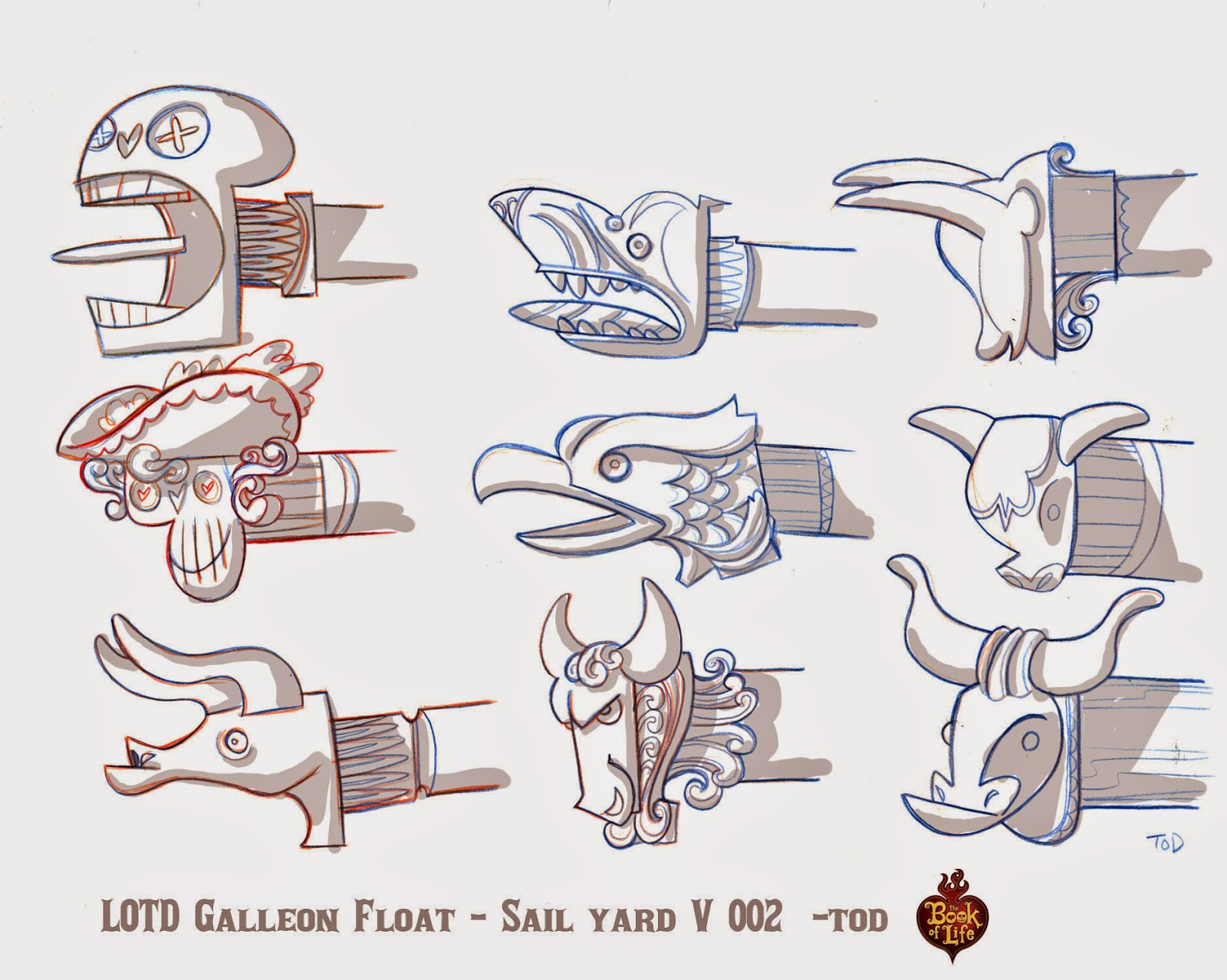
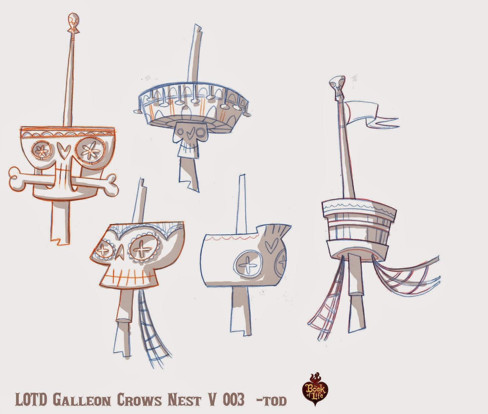
The Book of Life: Galleon Parade Floats
One of the areas I focused on in the "Book of Life" was the festive parade near the entrance to the "Land of the Remembered." Each float in the parade represented a different character from the movie. Here are but a few of the many sketches I made for the Galleon float.
Above: My first sketches captured the fractured quality that the creative leads were looking for... but weren't that unique to the world of the dead.
Above: So I played with more ornate versions of the ship. Thinking of it as a character unto itself.
Above: First I focused on the overall shape of the ship. Then I spent time detailing out areas that were important to the story. For example, in one version of the storyboard the hero lands on the ships sail yard, and another character jumps from the crows nest. -tod
Shaw Cable Valentine's Spot
Not too long ago I was asked to help design an ad for Shaw Cable. This was one of a series of commercials produced by Liaka House, and directed by the multi-talented Aaron Sorensen.
Above: Color studies.
For this particular spot I was asked to push the color and lighting by adding subtle hints of yellow, purples and aquas not found in most Shaw spots. Even this subtle approach was a huge leap for the client... who in the end decided on a more muted version.
Above: More keys and exploratory sketches.
A number of people have asked me about my approach to color scripting. As you can see... it's very simple. Many designers get caught up in making beautiful art, and forget that it is the final film image that matters most. I've found that it's far better to put down a lot of quick loose ideas than spend a lot of time on a few highly rendered keys. Yes, there is a time for that too! But not in a rough color script. This method will give the client and director more to choose from... and increases the chance of getting something interesting on the screen.
PERSONAL NOTE: Most of this year has been spent balancing freelance, teaching, and a new son! Thus I've been unable to post as often as I would like. But thank you for checking in every once in a while for new updates and posts. - Cheers... tod
Above: Color studies.
For this particular spot I was asked to push the color and lighting by adding subtle hints of yellow, purples and aquas not found in most Shaw spots. Even this subtle approach was a huge leap for the client... who in the end decided on a more muted version.
A number of people have asked me about my approach to color scripting. As you can see... it's very simple. Many designers get caught up in making beautiful art, and forget that it is the final film image that matters most. I've found that it's far better to put down a lot of quick loose ideas than spend a lot of time on a few highly rendered keys. Yes, there is a time for that too! But not in a rough color script. This method will give the client and director more to choose from... and increases the chance of getting something interesting on the screen.
PERSONAL NOTE: Most of this year has been spent balancing freelance, teaching, and a new son! Thus I've been unable to post as often as I would like. But thank you for checking in every once in a while for new updates and posts. - Cheers... tod
Labels:
aaron Sorensen,
Color design,
color scripts,
commercial,
concept,
Tod Polson
Jingle Bells
A number of years ago I proposed a title sequence for a series of direct to DVD Christmas specials I was supervising in the Philippines. My inspiration was classic Christmas card art. There was no real budget per say, so I proposed titles that would be inexpensive to produce, using lots of animation cycles, and panning artwork etc. Ultimately the studio decided to go in a different direction... and even though these are just rough sketches, there is something about them that I like.
All art copyright Tod Polson
Labels:
animation,
Christmas Card,
color,
concept,
design,
Hyperion,
Tod Polson
Flea N' E.Z.
A concept I've been kicking around for a few years. A tug of war between good and evil, heaven and hell in the animal kingdom. Some fun story ideas... but recently I discovered that there might be a similar concept currently in production in Europe. This will be the second time this year that a concept that is similar to something I've pitched recently has been put into production elsewhere! Frustrating? ... Yes! But... C'est la guerre!
Labels:
concept,
Tod Polson
Subscribe to:
Posts (Atom)